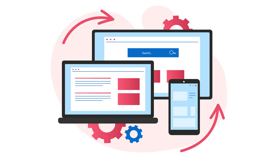
In today’s digital age, having a website that is optimized for mobile devices is crucial for businesses of all sizes. With more than half of all internet traffic coming from mobile devices, having a website that looks great and performs well on smartphones and tablets is no longer optional.
However, there is often confusion about what it means for a website to be mobile-friendly versus mobile-optimized. While these terms are sometimes used interchangeably, they actually refer to different things. In this article, we will explore the differences between mobile-friendly and mobile-optimized websites and discuss why it is important to understand these differences when developing a website.
Mobile-Friendly Websites
A mobile-friendly website is designed to look and function properly on a mobile device. This means that the website will adjust to fit the smaller screen size of a smartphone or tablet and will be easy to read and navigate using touch-based inputs.
One of the key characteristics of a mobile-friendly website is that it is built using a responsive design. Responsive design is a web development technique that allows a website to adapt to the screen size of the device it is being viewed on. This means that the website will look great and function properly on desktops, laptops, tablets, and smartphones without requiring a separate mobile-specific version of the site.
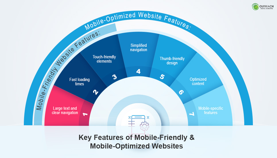
A mobile-friendly website will typically have a few key features that make it easy to use on a mobile device. These may include:
- Large text and clear navigation: On a mobile device, it can be difficult to read small text or navigate a website with lots of links close together. A mobile-friendly website will use large, easy-to-read text and clear navigation menus to make it easy to find what you’re looking for.
- Fast loading times: Mobile devices often have slower internet connections than desktop computers, so a mobile-friendly website will load quickly and efficiently to ensure a smooth user experience.
- Touch-friendly elements: Since mobile devices use touch-based inputs instead of a mouse and keyboard, a mobile-friendly website will have elements that are easy to interact with using touch inputs. This may include larger buttons, swipe gestures, and pinch-to-zoom functionality.
Mobile-Optimized Websites
While a mobile-friendly website is designed to work well on a mobile device, a mobile-optimized website takes things a step further. A mobile-optimized website is specifically designed to provide an optimal user experience on a mobile device, with features and functionality that are tailored to the unique needs of mobile users.
A mobile-optimized website will typically have all of the features of a mobile-friendly website, but with additional elements that are specifically designed for mobile users. These may include:
- Simplified navigation: Mobile users are often on the go and looking for quick answers, so a mobile-optimized website will typically have simplified navigation menus that make it easy to find what you’re looking for quickly.
- Thumb-friendly design: Since mobile users typically use their thumbs to interact with their devices, a mobile-optimized website will have elements that are easy to reach and interact with using just your thumb. This may include placing important elements towards the center of the screen and using larger buttons and touch targets.
- Optimized content: Mobile users have different needs and preferences than desktop users, so a mobile-optimized website will typically have content that is tailored to the needs of mobile users. This may include shorter paragraphs, larger headlines, and more visual content.
- Mobile-specific features: A mobile-optimized website may include features that are specifically designed for mobile users, such as click-to-call buttons, location-based services, and mobile-friendly forms.
Mobile-Optimized Vs. Mobile-Friendly: Which One Should You Choose?
When deciding between a mobile-optimized and a mobile-friendly website, there are several factors to consider. The first factor to consider is your audience. If the majority of your audience is accessing your website on mobile devices, then a mobile-optimized website may be the best choice. This is especially true if you have a mobile-first audience, such as a gaming or social media app.
Another factor to consider is the type of content that you are offering. If your website is primarily text-based, such as a blog or news site, then a mobile-friendly website may be sufficient. However, if your website includes multimedia content, such as videos or interactive features, then a mobile-optimized website may be necessary to ensure that the content loads quickly and performs well on mobile devices.
Your budget is also an important consideration. Mobile-optimized websites are typically more expensive to create and maintain than mobile-friendly websites. This is because they require custom design and development to ensure that they are optimized for mobile devices. If you have a limited budget, then a mobile-friendly website may be the best choice.
Finally, your business goals should also be taken into consideration. If your goal is to generate leads or sales through your website, then a mobile-optimized website may be the best choice. This is because mobile-optimized websites are designed to offer an optimal user experience, which can increase the likelihood of users taking action on your website. However, if your goal is simply to provide information to your audience, then a mobile-friendly website may be sufficient.
Why Mobile Optimization Matters
In today’s digital age, mobile optimization has become crucial for businesses to succeed. With more than half of all internet traffic coming from mobile devices, it is more important than ever for businesses to ensure that their website is optimized for mobile devices. In this article, we will explore why mobile optimization matters and how it can benefit your business.
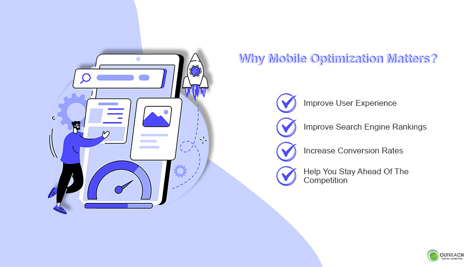
1. Improve User Experience
First and foremost, mobile optimization can improve the user experience. When a website is not optimized for mobile devices, it can be difficult for users to navigate and find the information they need. This can lead to frustration and ultimately drive potential customers away from your site. By optimizing your website for mobile devices, you can provide a seamless and intuitive user experience, making it easier for users to engage with your content and take the desired action.
2. Improve Search Engine Rankings
Furthermore, mobile optimization can also improve your search engine rankings. Google, the world’s leading search engine, has stated that mobile-friendliness is a key factor in their ranking algorithm. This means that websites that are optimized for mobile devices are more likely to appear higher in search engine results pages, leading to increased visibility and traffic to your website.
3. Increase Conversion Rates
In addition, mobile optimization can also increase conversion rates. When a website is optimized for mobile devices, it can load faster, making it easier for users to find the information they need and take the desired action. This can lead to increased engagement and ultimately drive more conversions, whether that be making a purchase, filling out a form, or signing up for a newsletter.
4. Help You Stay Ahead Of The Competition
Finally, mobile optimization can also help you stay ahead of the competition. With more and more businesses recognizing the importance of mobile optimization, it is becoming increasingly necessary for businesses to keep up. By optimizing your website for mobile devices, you can ensure that you are providing the best possible user experience and staying ahead of the competition.
Optimize Your Website To Get The Best Mobile Presence
Having a mobile presence has become increasingly important for businesses in the digital age. However, it’s essential to understand the difference between mobile-friendly and mobile-optimized websites. While a mobile-friendly website adapts to the size of the mobile screen, a mobile-optimized website is specifically designed for mobile devices to provide a seamless user experience. Therefore, it’s crucial for businesses to consider their target audience and the purpose of their website to decide which option is best for them.
Ultimately, investing in a mobile-optimized website can provide a competitive advantage in the digital marketplace, as more and more consumers turn to mobile devices for their online activities. If you haven’t already, now is the time to start optimizing your website for mobile devices to ensure that you are reaching your target audience and achieving your business goals.
Contact Outreach Digital Marketing To Take Your Online Presence To The Next Level
Outreach Digital Marketing is here to help you take your online presence to the next level. Our team of highly experienced professionals is well-equipped and knowledgeable in topics from SEO and website design, to targeted social media campaigns. We offer custom solutions tailored specifically to your business goals allowing us to make sure you get the highest return on investment.
At Outreach Digital Marketing, we strive to provide solutions that exceed expectations. Our full-service agency is here to help you take your online presence to the next level. You can count on us for personalized, strategic advice that will create a lasting impact and give your organization or business a competitive advantage. We are proud of our reputation for providing exceptional customer service and top-notch service-based solutions tailored to each individual business’s unique needs. We want to be the bridge between you and success, whatever that looks like for your brand. To discuss how we can be of assistance, call us today to schedule a free consultation.